Interest in decorative brick almost always arises when an interior lacks texture. Smooth, painted walls look neat, but sometimes too neutral. A brick surface seems like a simple solution: it immediately adds character, depth, and a sense of "real" material. However, it's at the design stage that the most questions arise. Some envision rough, loft-style brickwork, others a neat, light, antique texture, and still others a subtle relief as a backdrop for furniture. Behind this apparent simplicity lies a whole set of principles that are important to understand even before decorative brick appears on the wall.
The essence of decorative brick as a technique
Decorative brick is less a material than a visual element. Its purpose isn't to literally imitate brickwork, but to create a sense of rhythm, weight, and texture. That's why it can be made from various materials, vary in thickness, and even have a certain "irregularity." In interiors, it functions as an active backdrop rather than a neutral surface.
Perceptually, a brick wall immediately establishes scale. A small format visually fragments the space and makes it more intimate, while a large format, on the contrary, emphasizes the expanse and can enhance the feeling of spaciousness. Color and depth of relief are equally influential: light decorative brick feels almost like plaster with a pronounced texture, while dark brick is a standalone accent that draws the eye.
It's important to understand that decorative brick always "converses" with the surrounding finishes. It rarely exists in isolation: smooth walls, wood, metal, and textiles appear alongside it. And the way these elements balance each other determines whether the interior will appear cohesive or overloaded.
The principle of forming a brick surface
Unlike traditional brickwork, decorative brick does not bear any structural load. This frees it from strict building codes, but also makes it more susceptible to visual errors. The key principle here is verisimilitude. Even if the brick is conventional, the eye still detects patterns: repetition, the rhythm of the joints, the logic of the "laying."
In practice, this means the surface should appear cohesive, not like a collection of random elements. Fragments that are too uniform create a sense of artificiality, while excessive randomness creates visual noise. Balance is achieved through moderate variations: small differences in shape, hue, and relief depth.
Another important aspect is the grout. It's just as important as the brick itself. Its thickness, color, and precision determine the overall impression. Contrasting grout highlights the graphic and adds visual interest to the wall, while similar grout tones soften the texture and visually unify the surface.
How decorative brick works in interiors
In real interiors, decorative brick rarely covers entire walls. More often, it's used in fragments—as an accent or backdrop for a specific area. This is due not only to aesthetics but also to the perception of space. A large area of active texture quickly becomes tiring and overwhelming.
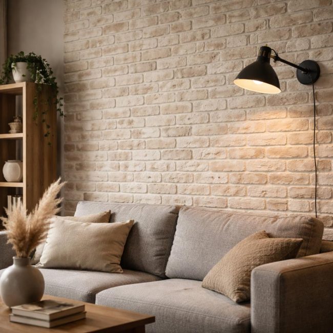
In the living room, a brick wall often becomes a visual anchor: behind the sofa, around the fireplace, or in the TV area. Here, it acts as a stage for furniture and decor. In the kitchen, decorative brick is perceived differently—as a hint of industrial or handcrafted style, especially when paired with wood and open shelving. In the bedroom, it is used more sparingly: soft tones and a shallow texture help maintain a cozy feel.
Hallways and stairwells are a special case. Here, the brick texture compensates for the lack of natural light and adds character to the space. However, it's in these areas that errors in scale and color are especially noticeable: a surface that's too dark or rough can make the passageway appear narrower.
Consequences of choosing texture and color
Choosing decorative brick always has a deferred effect. What looks striking on a small sample may look completely different on a wall. The deep texture intensifies shadows and highlights uneven lighting. In a room with side lighting, it looks striking, but with uniform illumination, it can appear flat or, conversely, excessively rippled.
Color also influences the perception of space. White and light beige are often chosen for their versatility, but they quickly become overlooked, revealing every shadow and seam. Warm shades make the interior cozier, while cooler ones create a more formal and graphic feel. Rich, dark colors require visual pauses: smooth surfaces, light, and air.
There's also a practical aspect: a textured surface is more susceptible to dust and fine dirt. This isn't a problem in itself, but it's a factor to consider when choosing a target area.
Limitations and subtleties
Decorative brick isn't equally appropriate in every space. In small rooms with low ceilings, it can visually "heavy" the walls. In such cases, scale and orientation are important: vertically elongated elements or smaller formats create a more subtle effect than larger bricks.
Another limitation is related to interior style. Brick is often associated with lofts, but in reality, it can be part of a Scandinavian, eclectic, or even classic space. Problems arise when the texture isn't supported by other elements. If the furniture and finishes are "from another era," the brick wall begins to look random.
It's also worth remembering the line between decorativeness and imitation. When attempts are made to make brick "too real," emphasizing cracks, chips, and unevenness without a clear intention, the surface quickly loses its elegance and begins to look theatrical.
Common misconceptions about decorative brick
One of the most common misconceptions is the idea that decorative brick automatically makes an interior stylish. In reality, it merely reinforces the direction already established by the space. In an empty or poorly designed interior, it highlights the chaos rather than conceals it.
Another mistake is trying to cover up a "problem" wall with brick. If the surface is uneven or the space is poorly planned, a bold texture will only draw attention to it. Brick works well where there's a logical composition and a clear role for the wall.
The impact of lighting is also often underestimated. Without thoughtful lighting, decorative brick loses depth or appears heavy. Lighting here isn't decoration, but a tool that makes the texture visible and vibrant.
Instead of a formal conclusion
Decorative brick on a wall is always a dialogue between material and space. It abhors random solutions and is equally repulsed by both excessive neatness and deliberate "roughness." Understanding the principles of its perception helps avoid disappointment and see it not as a trendy technique, but as a fully-fledged interior design tool. When a brick surface appears in the right place and in the right role, it ceases to be decorative and becomes part of the home's architecture.